
Players
This guide shows how to use and customize JOIN Stories players in your iOS application.
Player View configuration
You can customize the player that opens when the trigger is clicked. You can customize the configuration for player in standalone mode or with a trigger :
let playerConfiguration: JoinStoriesPlayerConfigurations = JoinStoriesPlayerConfigurations()

let playerView = JoinStoriesPlayer(playerConfiguration, alias: "<your_join_alias>")
let playerConfiguration: JoinStoriesPlayerConfigurations = JoinStoriesPlayerConfigurations()
let trigger = BubbleTriggerView(playerConfiguration, ...)
Player view type
You can force the player to use horizontal mode for stories or vertical mode for short videos if you don't want to rely on the JOIN Studio settings.
let configuration = JoinStoriesPlayerConfigurations(playerType: .story)
//or
let configuration = JoinStoriesPlayerConfigurations(playerType: .vertical)
Player View Start Opening Animation (only standalone mode)
The start opening animation can be changed when the player is used in standalone mode. By default, the animation start from the bottom of the screen.
// enum PlayerStandaloneAnimationOriginType {
//    case top
//    case topLeft
//    case topRight
//    case bottom
//    case bottomLeft
//    case bottomRight
// }

JoinStoriesPlayerConfigurations(playerStandaloneAnimationOrigin: PlayerStandaloneAnimationOriginType)
Player Vertical Anchor
The attribute changes the player anchor when the player's height is smaller than screen height. The default anchor is .top
// enum PlayerVerticalAnchorType {
//    case top
//    case bottom
//    case center
//}

JoinStoriesPlayerConfigurations(playerVerticalAnchor: PlayerVerticalAnchorType)
Player Background Color
The attribute changes the background color of player. The background color is .black by default
JoinStoriesPlayerConfigurations(playerBackgroundColor: UIColor)
Player Horizontal Margins
The attribute changes the player's left and right margins. By default, the player has no margin.
JoinStoriesPlayerConfigurations(playerHorizontalMargins: CGFloat)
Player Corner Radius
The attribute changes the corner radius of player. By default, the corner radius is 0.
JoinStoriesPlayerConfigurations(playerCornerRadius: CGFloat)
Player Progress Bar
These attributes change the style of the progress bar at the top of the player
JoinStoriesPlayerConfigurations(playerProgressBarDefaultColor: UIColor)
JoinStoriesPlayerConfigurations(playerProgressBarFillColor: UIColor)
JoinStoriesPlayerConfigurations(playerProgressBarThickness: CGFloat)
JoinStoriesPlayerConfigurations(playerProgressBarRadius: CGFloat)
Tip
Default Color : The default color is
.whitewith 50% of alphaFill Color : The default color is
.whiteThickness : By default, the thickness is
2Radius : By default, the radius is
6
Vertical Player configuration
SDK v3.9.0+
The Vertical Player is a new full-screen playback mode, as an alternative to the classic "story" player (horizontal navigation, chapters). It follows the conventions of vertical video feeds seen on social networks: vertical swipe navigation between stories, a vertical progress bar, and adapted controls.
Video sizing
videoSizing simply controls how the video fills the player's screen:
.fit : (default value): respect the 16:9 video format and keeps its original aspect ratio, with black bars if needed (letterboxed).
.fill: the video fills the entire screen edge-to-edge, cropping the image slightly if needed.
Player Standalone
JOINStories.showVerticalPlayer(
  alias: "<your_join_alias>",
  videoSizing: .fill
)
JOINVerticalPlayer(
  alias: "<your_join_alias>",
  videoSizing: .fit
)
Player Embedded
VerticalPlayerTriggerVC(
  alias: "<your_join_alias>",
  videoSizing: .fill
)
JOINVerticalPlayer(
  alias: "<your_join_alias>",
  videoSizing: .fill
)
Action buttons
What is it?
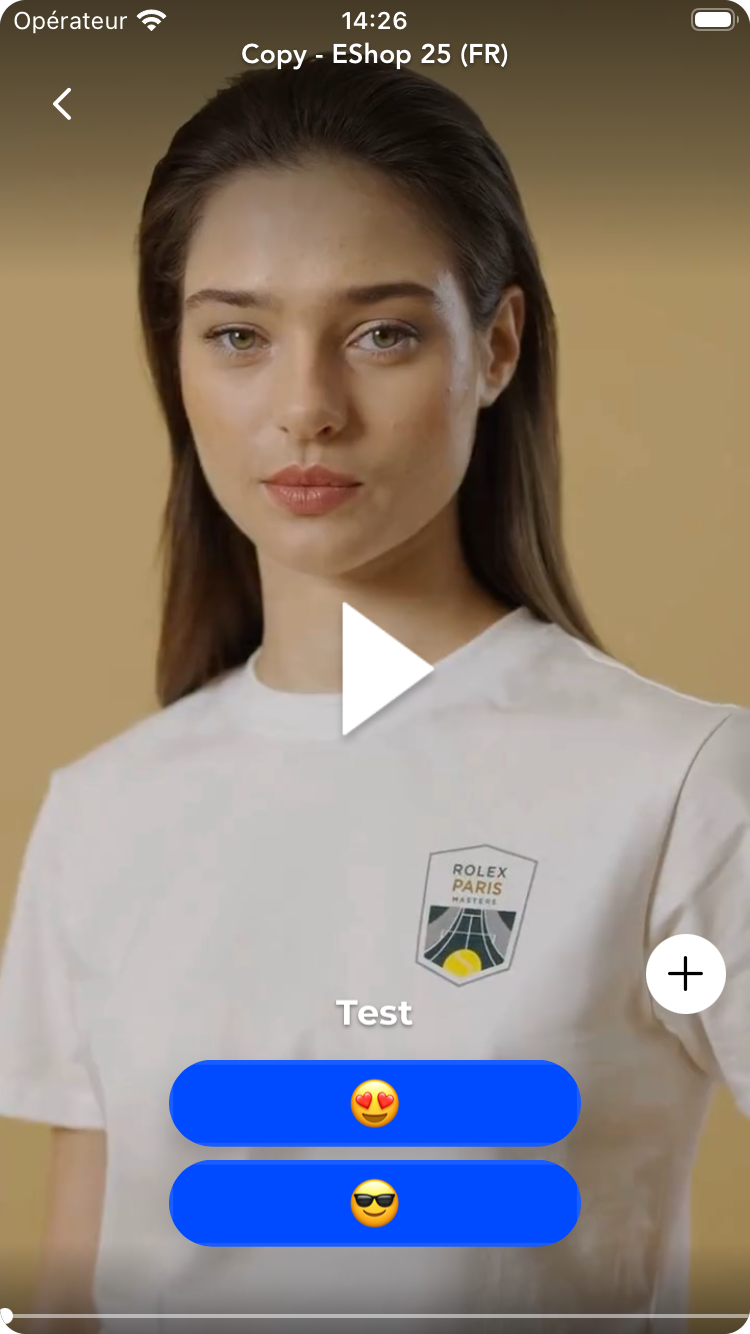
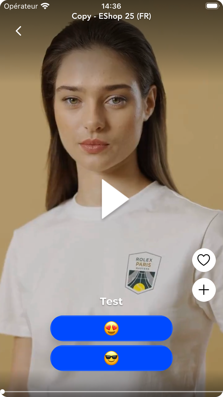
The Vertical Player exposes a space where your app can add its own action button (for example, an "Add to my list", "Like" or "Share", button). Just provides your View or Button. JOIN just gives it a place to live and tells it which story is currently on screen.
How it works?
- You provide an array of view. All button's UI customization and logic is in your hands.
- SDK renders it in a fixed spot on the right side of the Vertical Player.
- SDK passes the current story to your component whenever the user swipes to a new one.
- Everything else, state, styling, click handling, network calls : is entirely up to you.
- SDK does not store or manage the button's state. If a user taps it, that's your app's logic to handle.
- Your component gets the current story object as input, with public fields only. No private or internal data is passed.
What's inside storyData ?
storyId: String?(Id of the current story)title: String?(Title of the current story)lastPublishDate: Int?(Last published date from studio of the current story)url: String?(Current story's url)isViewed: Bool(Indicates if current story is already watched or not)
// Example for single action button (e.g. Screen 1)
JOINStories.showVerticalPlayer(
  alias: "your-story-alias",
  customActionButtons: { storyData in
                        guard !storyData.isEmpty, let sSelf else { return \[] }
                        return [MyAddToListButton()]
                       }
)

// Example for few action buttons (e.g Screen 2)
JOINStories.showVerticalPlayer(
  alias: "your-story-alias",
  customActionButtons: { storyData in
                        guard !storyData.isEmpty, let sSelf else { return \[] }
                        return [MyAddToListButton(), MyLikeButton()]
                       }
)
// Example for single action button (e.g. Screen 1)
JOINVerticalPlayer(
  alias: "<your_join_alias>",
  customActionButtons: { storyData in
                        guard !storyData.isEmpty, let sSelf else { return \[] }
                        return [MyAddToListButton()]
                       }
)

// Example for few action buttons (e.g Screen 2)
JOINVerticalPlayer(
  alias: "<your_join_alias>",
  customActionButtons: { storyData in
                        guard !storyData.isEmpty, let sSelf else { return \[] }
                        return [MyAddToListButton(), MyLikeButton()]
                       }
)
Screen 1
Screen 2
Tips for placement
Action buttons are added from bottom to top of the space available and have a max height and width of 40.
Updated 3 months ago