
Players
This guide shows how to use and customize JOIN Stories players in your React Native application.
Vertical Player configuration
SDK v2.8.0+
The Vertical Player is a new full-screen playback mode, as an alternative to the classic "story" player (horizontal navigation, chapters). It follows the conventions of vertical video feeds seen on social networks: vertical swipe navigation between stories, a vertical progress bar, and adapted controls.
Video sizing
videoSizing simply controls how the video fills the player's screen:
.fit : (default value): respect the 16:9 video format and keeps its original aspect ratio, with black bars if needed (letterboxed).
.fill: the video fills the entire screen edge-to-edge, cropping the image slightly if needed.
Bubble and Card widgets
React Native SDK 2.9.1 does not expose videoSizing or playerType for JoinStoriesView and JoinStoriesCardView. To explicitly open a Vertical Player with a selected video sizing mode on both platforms, use JoinStories.showVerticalPlayer().
Player Standalone
import { JoinStories } from '@join-stories/react-native-widgets';

JoinStories.showVerticalPlayer({
  alias: '<your_join_alias>',
  videoSizing: 'fit',
});
Player Embedded
import { JoinVerticalPlayerView } from '@join-stories/react-native-widgets'

<JoinVerticalPlayerView
  alias="<your_join_alias>"
  videoSizing="fit"
  style={{ flex: 1 }}
/>
Action buttons
What is it?
The Vertical Player exposes a space where your app can add its own action button (for example, an "Add to my list", "Like" or "Share", button). Just provides your View or Button. JOIN just gives it a place to live and tells it which story is currently on screen.
How it works?
- You provide an array of view. All button's UI customization and logic is in your hands.
- SDK renders it in a fixed spot on the right side of the Vertical Player.
- SDK passes the current story to your component whenever the user swipes to a new one.
- Everything else, state, styling, click handling, network calls : is entirely up to you.
- SDK does not store or manage the button's state. If a user taps it, that's your app's logic to handle.
- Your component gets the current story object as input, with public fields only. No private or internal data is passed.
What's inside storyData ?
iOS
storyId: String?(Id of the current story)title: String?(Title of the current story)lastPublishDate: Int?(Last published date from studio of the current story)
Android
storyId: String(Id of the current story)title: String(Title of the current story)lastPublishDate: Long(Last published date from studio of the current story)
Define your buttons:
| Property | Type | Description |
|---|---|---|
id | string | Your button identifier, returned in click callbacks and analytics. |
title | string | The button’s analytics title and accessibility label. |
icon | ImageSourcePropType | A local image loaded with require() or a remote image using { uri }. |
{
    id: '<your_button_id>',
    title: '<your_button_title>',
    icon: require('<your_button_icon>'),
}
Embedded player
import {
  JoinStories,
  JoinVerticalPlayerView,
  type VerticalPlayerActionButton,
} from '@join-stories/react-native-widgets'

// Example for a share and wishlist buttons.
const customActionButtons: VerticalPlayerActionButton[] = [
  {
    id: 'share',
    title: 'Share story',
    icon: require('./assets/share.png'),
  },
  {
    id: 'wishlist',
    title: 'Add to wishlist',
    icon: require('./assets/wishlist.png'),
  },
]

// Integrating action buttons in ebedded player for example.
export function VerticalPlayerScreen() {
  return (
    <View style={{ flex: 1 }}>
      <JoinVerticalPlayerView
        alias="<your-join-alias>"
        customActionButtons={customActionButtons}
        style={{ flex: 1 }}
      />
    </View>
  )
}
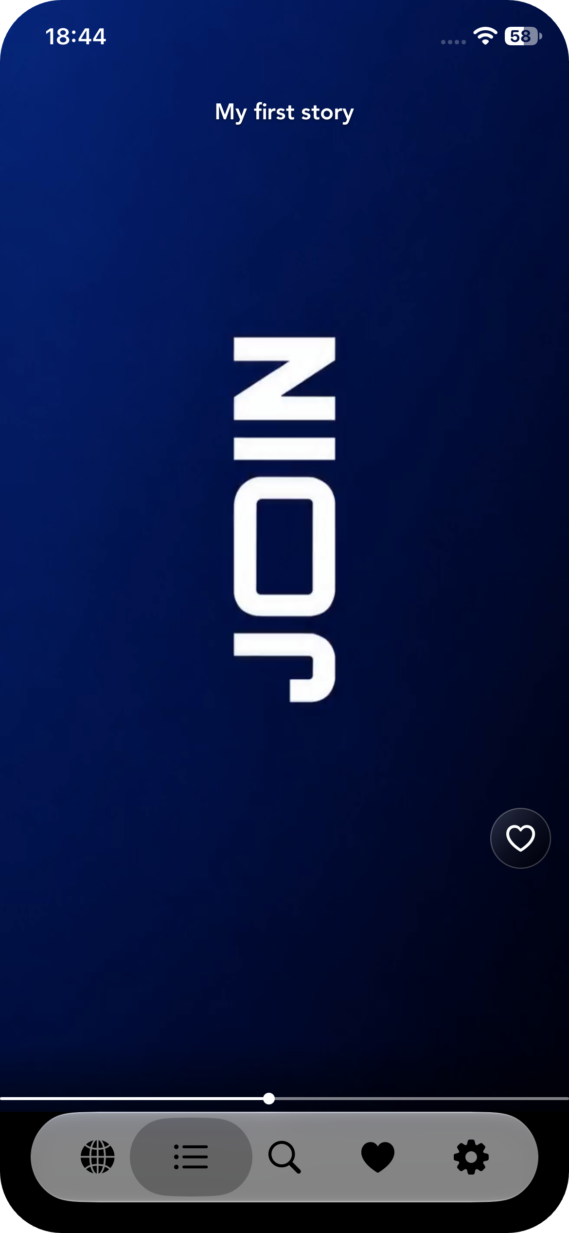
Screen 1
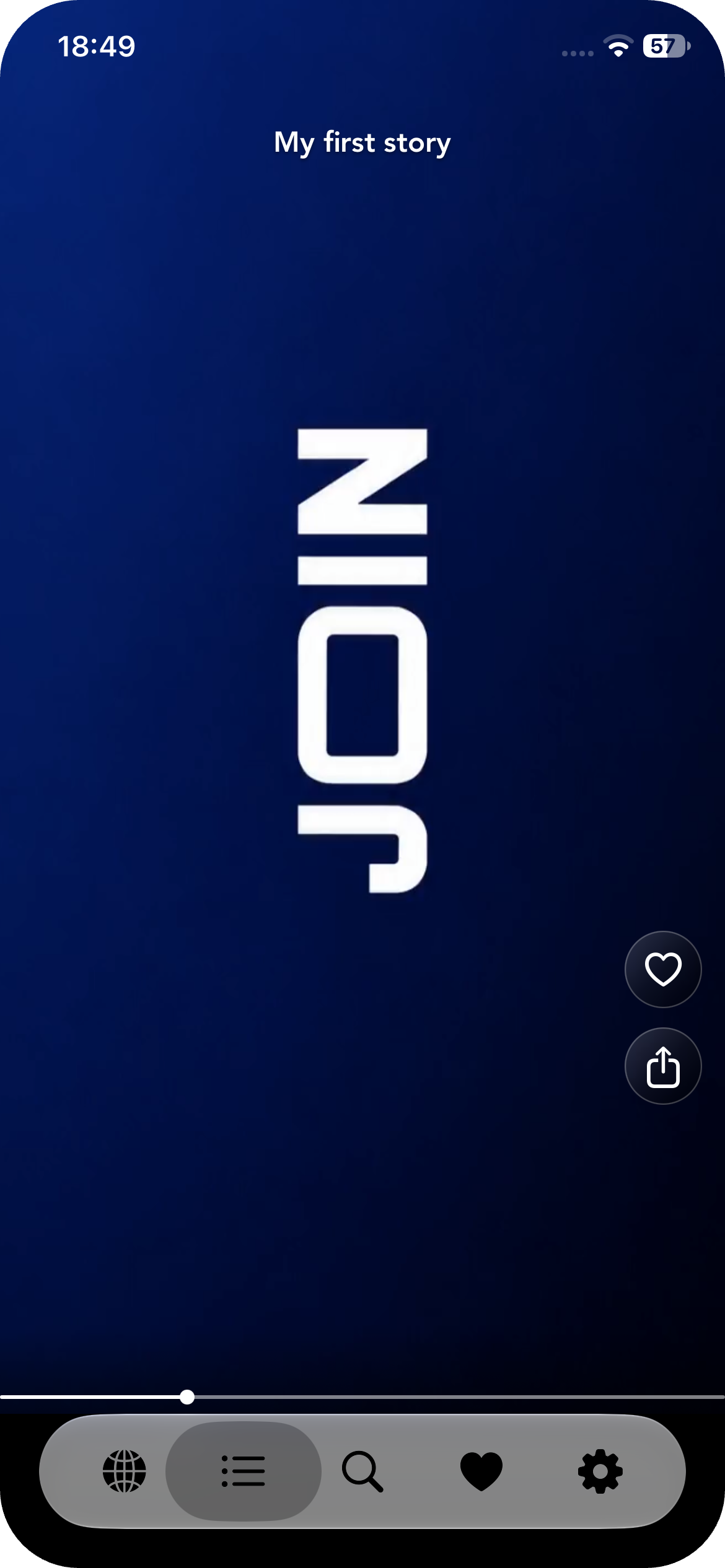
Screen 2
Tips for placement
Action buttons are added from bottom to top of the space available and have a max height and width of 40.
Updated about 7 hours ago